 ApostropheCMS
Customizing the user interface
This guide focuses on how to customize Apostrophe's administrative user interface, or "admin UI." The built-in functionality covers most situations, but sometimes you'll want to add or change functionality.
WARNING
- Altering the UI should be done rarely and carefully. When possible, add new functionality like custom schema field types and custom manager view columns. Avoid overriding components entirely unless absolutely necessary.
- Overriding a UI component prevents the project from benefiting from future UI improvements and bug fixes related to that component.
- Make sure there is not a better way to achieve the desired goal. This includes asking for help in Discord and requesting or contributing new features for the core.
- Apostrophe version 3.x used Vue 2.x to power the Admin UI components. With newer versions of Apostrophe, those same components are powered by Vue.js 3.x. We have taken care to include as much backward compatibility as possible, but custom components added in earlier versions of Apostrophe may need modification.
Apostrophe admin UI file structure
Apostrophe's admin UI is implemented with Vue.js. It is built from many .vue files across various Apostrophe modules. These are typically found in Apostrophe core, but they can be anywhere in the project. This means that we can introduce our own Vue components to the admin UI just by adding .vue files to the ui/apos/components subdirectory of any Apostrophe module. As explained below, it is also possible to override existing components by supplying a component with the same name.
Rebuilding the UI when we make changes
For performance reasons, Apostrophe projects are not configured to automatically rebuild the admin UI every time your code changes. This makes sense because in most projects there is no custom admin UI code, and it takes time to build.
However, we can "opt-in" to rebuilding the UI on every code change, like this:
APOS_DEV=1 npm run devFor convenience, you may wish to set this environment variable for the lifetime of your terminal session:
export APOS_DEV=1Of course the admin UI is always rebuilt when deploying. No special changes or environment settings are needed for production use.
Registering custom field types
Apostrophe's schema field types cover many situations, but we might wish to add a new one.
Since it is a larger topic that touches on more than just UI, we've created a separate article on how to add a custom field type. However, note that you will find it easier to follow the remainder of this article if you read that article first.
Adding custom columns to the piece type manager
Another common extension is a custom column for the piece type manager. By default the manager modal displays the title, certain flags, and the last time the piece was updated. We can extend this to display our custom star ratings.
Implementing the server-side part
Let's look at a simple piece type module called review that takes advantage of the starRating field type we define in a separate article. We'll add a rating field to the schema for the piece type, and also add a column to display it in the manager modal:
module.exports = {
  extend: '@apostrophecms/piece-type',
  fields: {
    add: {
      rating: {
        type: 'starRating',
        label: 'Star Rating',
        required: true
      }
    }
  },
  columns: {
    // 👇 Columns are a "cascade" just like fields,
    // we have an "add" property with a subproperty
    // for each column
    add: {
      rating: {
        // 👇 Each column has a label property and a
        // component property. The component name must
        // exist as a Vue component
        label: 'Rating',
        component: 'ColumnStarRating'
      }
    }
  }
};
Implementing the browser-side part
This code makes reference to a Vue component, ColumnStarRating, that doesn't exist yet. Next we'll introduce that component:
<template>
  <p
    class="apos-table__cell-field"
    :class="`apos-table__cell-field--${header.name}`"
  >
    <span v-if="hasValue">
      <span v-for="index in 5" :key="index" class="rating">{{ isActive(index) ? '☆' : '★' }}</span>
    </span>
    <span v-else>
      None
    </span>
  </p>
</template>

<script>
import AposCellMixin from 'Modules/@apostrophecms/ui/mixins/AposCellMixin';

export default {
  name: 'ColumnStarRating',
  mixins: [ AposCellMixin ],
  computed: {
    hasValue() {
      return this.get(this.header.name) != null;
    }
  },
  methods: {
    isActive(index) {
      return index <= (this.get(this.header.name) || 0);
    }
  }
};
</script>
While the Vue component could be placed in any module, it makes the most sense to group it in the star-range-field module because it might be used as a column in any piece type, not just a review.
This component uses AposCellMixin to do two important things:
- The component gains access to the configuration of the column by accessing the
headerprop, which is automatically declared by the mixin. - The component can fetch properties from the piece by invoking
this.getwith any property name. Following Apostrophe's convention this method automatically fetches from the published version of the piece if it exists, otherwise from the draft.
Overriding standard Vue.js components by name
Most of the time we don't need to override admin UI components that ship with Apostrophe. But if we have a need, we can do so by placing a file with the same name as a standard component in the ui/apos/components subdirectory of a project-level module. You can also do this in a custom npm module to achieve reuse across projects.
Apostrophe will use only the last version of a component that it finds during startup. The general startup order is:
- Core Apostrophe modules
- Installed and project-level modules, in the order they are configured in
app.js
For instance, if the last module in our project's app.js modules list contains a ui/apos/components/AposLogPadless.vue file, that logo will be used in the admin bar, in place of the version that is normally loaded from Apostrophe core or in any module configured earlier.
INFO
For more information about the patterns used, props provided and APIs needed to override an existing core component, it's necessary to study the source code of the original.
Overriding standard Vue.js components through configuration
There can be only one AposDocsManager component definition in a project, but sometimes we need different behavior for a specific piece type. We could work around this by overriding a core component and adding conditional logic, but this results in code that is hard to maintain, and also means we are stuck maintaining a copy of a complex component and missing out on bug fixes and improvements. It would be better to specify a different, custom component name to be used to manage a particular piece type.
Here is an example of how to do that:
module.exports = {
  extend: '@apostrophecms/piece-type',
  options: {
    components: {
      managerModal: 'AnnouncementManager'
    }
  }
}
With this configuration, Apostrophe will look for a Vue.js component called AnnouncementManager when the user selects "Announcements" from the admin bar, bypassing AposDocManager.
As for the actual Vue.js code, we would place that in modules/announcement/ui/apos/components/AnnouncementManager.vue.
Of course there are other components that can be overridden in this way, and the list is growing over time. Here are the components that can currently be overridden through configuration:
| Module | Option | Default |
|---|---|---|
@apostrophecms/piece-type | components.managerModal | AposDocsManager |
@apostrophecms/piece-type | components.editorModal | AposDocEditor |
@apostrophecms/page | components.managerModal | AposPagesManager |
@apostrophecms/page | components.editorModal | AposDocEditor |
@apostrophecms/widget-type | components.widgetEditor | AposWidgetEditor |
@apostrophecms/widget-type | components.widget | AposWidget |
For readability's sake, a . is used in the table above to separate sub-properties of options (see the example above for what the actual configuration looks like). If an option exists for @apostrophecms/piece-type it can be used for any module that extends it.
INFO
Since the type of an existing page can be changed, there is only one manager modal and only one editor modal for all pages, and those component names are configured on the @apostrophecms/page module. Piece and widget types can have their own type-specifc overrides.
If an option ends in Modal, the component is required to embed the AposModal component. For examples, look at the source code of the default components listed above.
The AposWidgetEditor component already provides a modal dialog box in which to edit the schema of any widget, so we won't need to configure a replacement unless we want to support editing directly on the page. AposRichTextWidgetEditor is an example of how to do this.
The AposWidget component has nothing to do with a typical site visitor experience. It is used only when displaying our widget while the page is in edit mode. While overriding this component is rare, the @apostrophecms/rich-text-widget module does so to provide a "click the text to edit" experience for rich text widgets. If you're just trying to enhance your widget with frontend JavaScript, you should write a widget player instead.
Before you override an editor modal, consider adding a custom schema field type instead.
Adding custom context menu items
Apostrophe offers a context menu that can be used to carry out certain operations on a document, such as 'preview', 'duplicate', and so on. We can add custom context menu items from within any module, targeting any Vue component that implements AposModal. For an example of this, see the code for the draft sharing modal. The menu registration should happen in the initialization phase. It is important to note that context menu operations will appear for all documents, even if added by a module associated with a specific type of document. However, take note of the various options below to limit when they appear.
Here is an example of how to add a custom context menu item labeled "My Menu Item".
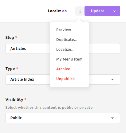
module.exports = {
  extend: '@apostrophecms/piece-type',
  options: {
    label: 'Article',
    pluralLabel: 'Articles'
  },
  init(self) {
    self.apos.doc.addContextOperation({
      context: 'update',
      action: 'myUniqueAction',
      label: 'My Menu Item',
      modal: 'MyModalComponent',
      conditions: [ 'canEdit', 'canPublish' ]
    });
  }
}
WARNING
Do not use core actions as your action property value - this would lead to unpredictable results and generally broken UI. You may consult what the core actions are in the AposDocContextMenu component logic props.
INFO
- The
context,action,label, andmodalproperties are required. - The current API supports only
context: 'update'(the custom menu items are available for previously saved documents). - The
actionproperty should be globally unique. - Overriding the same
actionis possible (the last wins). - You may mark the action as "dangerous" via an optional property
modifiers: [ 'danger' ](see the 'Archive' and 'Unpublish' menu items). - An additional optional boolean property
manuallyPublishedis supported. When set to true, the custom menu item is available only for document types that do not have theautopublish: trueorlocalized: falseoptions set. - The
conditionsproperty is optional. It takes an array of one or more strings specifying conditions that all must be satisfied to determine if the action can be run on the current doc. Valid values are: 'canPublish', 'canEdit', 'canDismissSubmission', 'canDiscardDraft', 'canLocalize', 'canArchive', 'canUnpublish', 'canCopy', 'canRestore' - The optional
moduleNameproperty can be used to override themoduleNameprop passed to the modal. By default, it will be the name of the piece type module corresponding to the individual piece, or@apostrophecms/pagein the case of pages. - For backward compatibility, this method can also be called with the
moduleNamepassed as the first argument and the object as the second, but this is discouraged.
Adding custom login requirements
In some cases, we might wish to enhance Apostrophe's login form with additional, custom steps.
This too is a larger topic that touches on more than just UI, so we've created a separate article on how to add a custom login requirement.
Editing custom widgets in context
While most widgets are edited most conveniently via the standard dialog box that appears when the edit button is clicked, some can be edited effectively "in context" right on the page. The standard rich text widget is a good example.
To learn how to implement this pattern for a custom widget, check out this separate article on how to edit custom widgets in context.